Despite the old adage, we all judge books by their covers. Presentation is what grabs attention and convinces consumers of a product’s value. That’s why in the CPG industry, attractive package design with the right messaging is paramount to success. It makes your product stand out on the shelf and encourages people to investigate what it is and who you are.
There are plenty of ways to create eye-catching product packaging, but the caveat with CPG products is that it also needs to be functional. This article discusses how to use graphic design and functionality together to create an effective retail package.
Why Is Packaging Design Important?
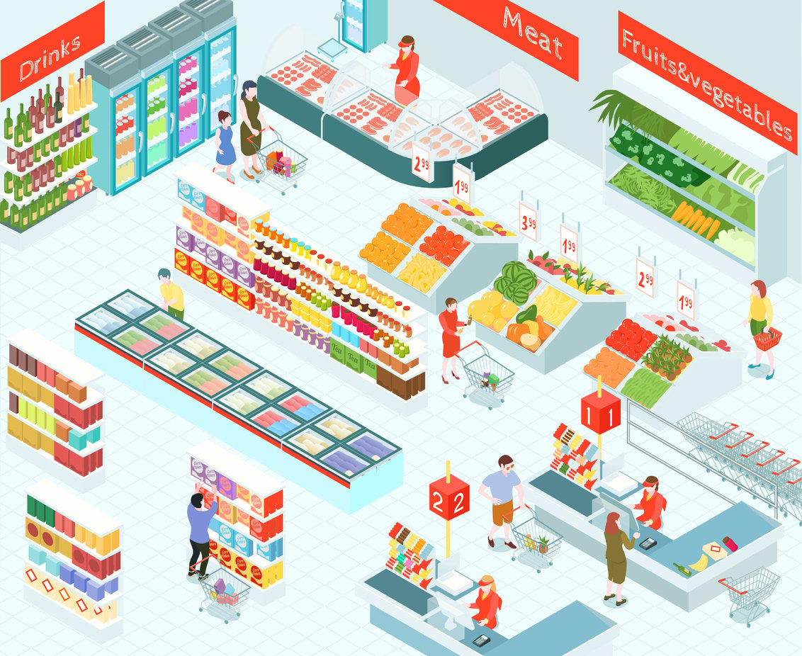
The retail space is quickly changing with the growing popularity of eCommerce and digital purchasing websites. Not only are brands competing on local retailers’ shelves, but now they also have to combat the wider online market. Instead of being faced with a handful of competitors, they might be combatting hundreds.
How do you compete with such a large market? With creative packaging design.
Packaging design helps you capture people’s attention, give them an elevator pitch of your brand, and let them make a decision on the spot. Seventy-two percent of consumers say that package design has a significant impact on their decision to buy a product.
Your retail product packaging is often a consumer’s first in-person experience with your brand, so you want to make sure to leave a good impression. Whether it’s pulling a protein bar off a grocery store shelf or unboxing a container of smoothie mix at home, your customer should enjoy the experience and feel like the product represents their investment.
Packaging design is an easy way to influence the perceived value of your product and in turn the actual pricing. Using high-quality packaging materials and relevant designs helps people ascribe a higher value to your brand. When you invest in your product, so will consumers.
Creating these attractive designs printed on quality materials is easier than you think. You can craft custom retail packaging with just your brand colors and fonts. If you’re a large company with a packaging designer on staff, then you can swing for the fences with complex designs and text schemes. If you’re a small business, then stick with a minimalist approach that you can design in-house. Packaging design doesn’t have to be complicated to be effective. Whatever route you choose, keep in mind that design works in tandem with other factors of effective product packaging.
What Makes Effective Product Packaging Design
When you start thinking about retail packaging design, there are three aspects to consider:
- Product
When you get down to it, one of the main goal of your packaging is to protect your product. Especially in food packaging, the design should focus on maintaining the integrity of the product and giving people an idea of what it looks like. Think about clear packaging design elements to show a product that is visually appealing and the quality graphic elements to represent the product otherwise when needed. Packaging needs to be sturdy enough to prevent damage to your product and have enough visual information to interest passersby.
- Design
A great design will get you far, but if no one can see it, it won’t do you much good. As you move through the design process, consider how your product will be displayed so you know where to place the most engaging elements. Use the primary surfaces to communicate your brand values, key attributes, and points of differentiation from the competition. Tell your potential customers why your product is different and why they should choose it over the other products on the shelf.
- Marketing
Package design is a critical part of marketing. Whether it’s a new product or an established one, packaging helps establish your brand identity and provide a highly visible marketing platform. Simply put, it is your on-shelf brand ambassador.
Aside from ensuring you address these three aspects of product packaging, you also need to keep in mind the more creative elements of your packages. First and foremost is color. Colors are important because they can evoke certain feelings in consumers. For example, blue evokes trust and red makes people hungry. Most importantly, your color palette should not only match your brand’s personality, but it needs to also support how you want the consumer to relate to the product inside the package.
Fonts are another important factor in creative retail packaging design. It can be tempting to distinguish your text with several different fonts, but that can actually be distracting for your customers. Stick to a limited number of fonts that are complementary to the brand and effectively communicate the specific messaging.
Another way to keep your packaging from being confusing is to make smart use of space. You don’t want to pack so much information onto your packaging that consumers can’t tell what’s important. Focus on the main points of your product—brand name and icon, product name, product description, and key attributes or points of differentiation.
All of these elements come together to make one great-looking package! When your colors, fonts, and content all reflect your brand message, you can draw in your target audience with ease and stand out on the shelves.
How to Make Your Brand Stand Out
Design is a great way to set yourself apart from the crowd, but it’s not the only way. Truly successful brands employ a few different methods to not only attract attention but build brand loyalty through experience.
Create an Unboxing Experience
With the rise of eCommerce and internet shopping, consumers are turning their attention to experiences as much as products. After waiting days or weeks for their items to arrive, they want to feel like it was well worth their patience. To cater to this desire, companies are going above and beyond to make their packaging more than just cardboard and shipping labels.
Think of your shipping boxes as gift boxes. You can add design, colors, or even use them as a platform for communicating with your customers. Add notes on or in the box with messages like “Hey there!” or “It’s finally here!” This engages directly with your customer and makes them feel like you’re part of their experience.
How you place the product inside your box makes a difference too. If you have multiple pieces or elements to your product, try to arrange them so people take them out of the box in order. Overall, you want to reduce the amount of friction points as they unpack your product and send it in a box they won’t want to throw away.
Go Eco-Friendly
Consumers are looking for more and more ways they can cut down on their carbon footprint, and sustainable packaging speaks to this desire. Using recycled or recyclable materials in your packaging shows you care about the environment and your brand is attempting to reduce its own carbon footprint. Eco-conscious consumers will resonate with that on a personal level and be more likely to choose your brand over one that packages using excessive materials or materials that have limited recycling options.
You can even use messaging on the packages that reflect your sustainability efforts. Notes like “Please recycle me” or “Made from recycled materials” don’t need to take up too much space to make a bold statement. Additionally, you can create social media posts about new products that align with your brand’s eco-friendly values. Show people how your products support the environment and where they can purchase them.
Design for the Destination
We discussed functionality a bit earlier, but let’s dive into more detail. When you consider package design, you should think about how it will be presented to consumers. For example, retail-ready packaging might look vastly different from direct-to-consumer packaging because the former is displayed among its competition.
Products going to a retailer often have two layers of packaging: the shipping boxes and the product inside. To make it easier for retail team members to stock, you can include perforated die cut lines or easy pull-open tabs on your product packaging. You should even go so far as creating your packaging to fit specific size dimensions to ensure they optimize the product effectively, and fit shelf dimensions and merchandising sets.
Whether your product gets positioned on an end cap, side panel, secondary display, or on the shelf, you need to create packaging that is as display-friendly as possible. No matter where your product is displayed, it should be designed to effectively communicate your message to the customer and be flexible and convenient for the retail team members to stock and replenish.
The orientation of product packaging (landscape vs. portrait) is often another consideration when it comes to display position and possible differentiation from the competition. It is also an important consideration as shelf space is always at a premium and your product’s ability to effectively utilize space is important. It can be a factor in the ultimate decision if a product is accepted or rejected for placement by a retailer.
Designing effective and functional product packaging is a process. It requires lots of forethought and purposeful planning that can quickly overwhelm some people. If you’d like a hand with designing attractive (and functional) retail packaging designs, reach out to us and we’d be glad to help!
Vdriven
VDriven is a CPG partner for modern brands that improve our daily lives. We fuel your growth and innovation by giving you strategies and support in every phase of the retail process.


